
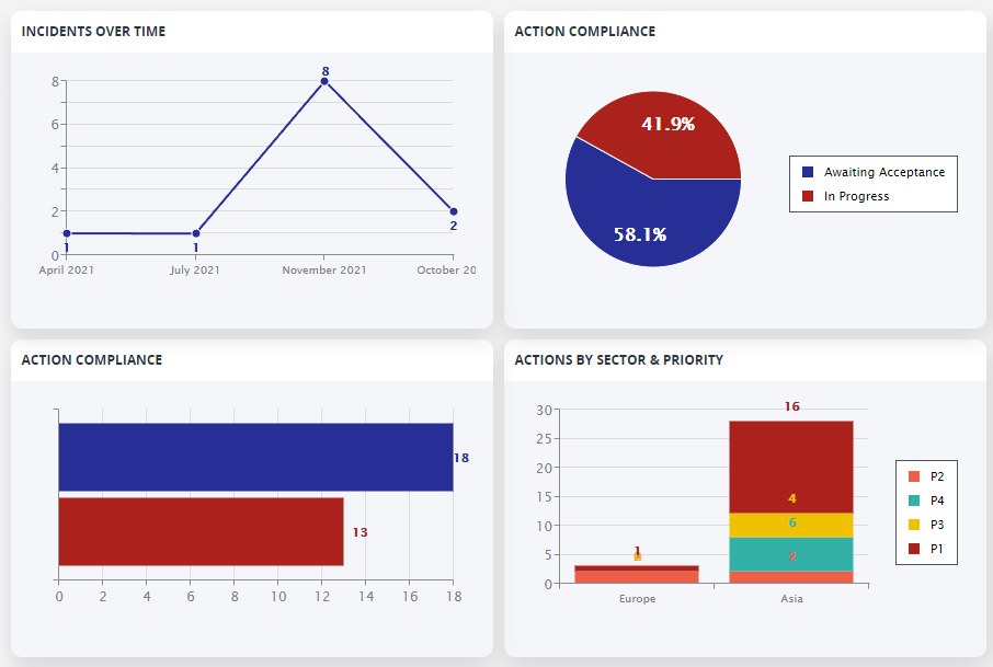
Chart Tiles within Dashboards used to only allow you to hover over them to see their numbers. Now, you have the ability to enable data labels on Charts to show the underlying numbers at all times, helping you analyse the data more easily, especially when sharing the Charts in static formats like Reports.
Here’s how they look when enabled:
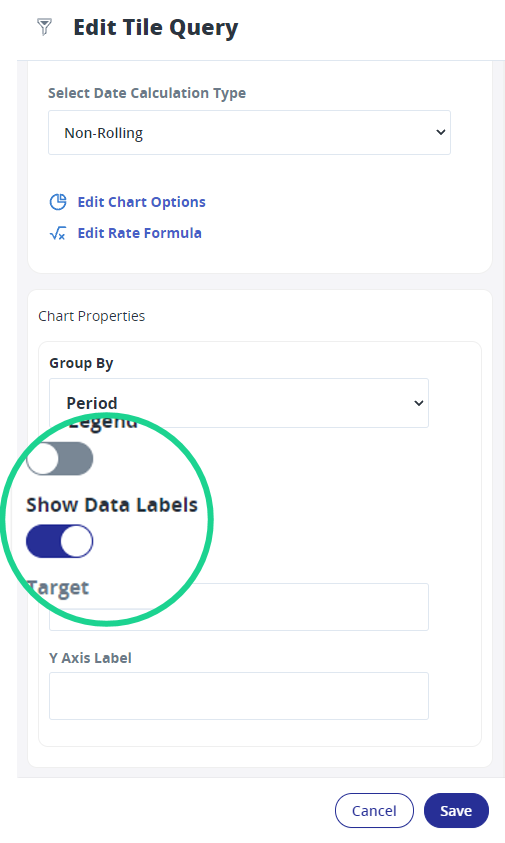
Look for the new “Show Data Labels” toggle option within top-level Chart Options when editing a Tile.
Hi – Is there any option to restrict decimal count at Graphs – specially at Audit percentage scores have 10 decimals and graphs are quite messy. Would like to restrict decimal count to 1 or 2 digits..?
Any option to restrict decimals…?
Hi Sami,
It is not currently possible to restrict on decimal places for the count. We do have it in our backlog for the Analytics functionality.
Thanks, Jade