Digital Signatures
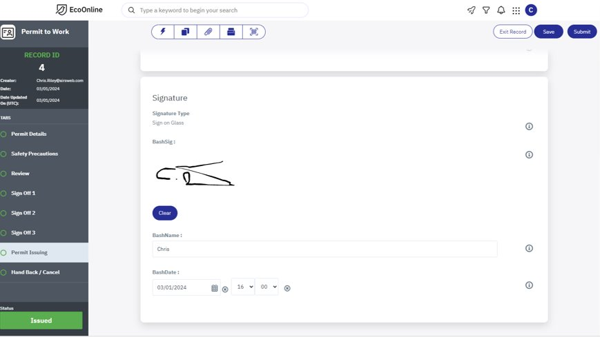
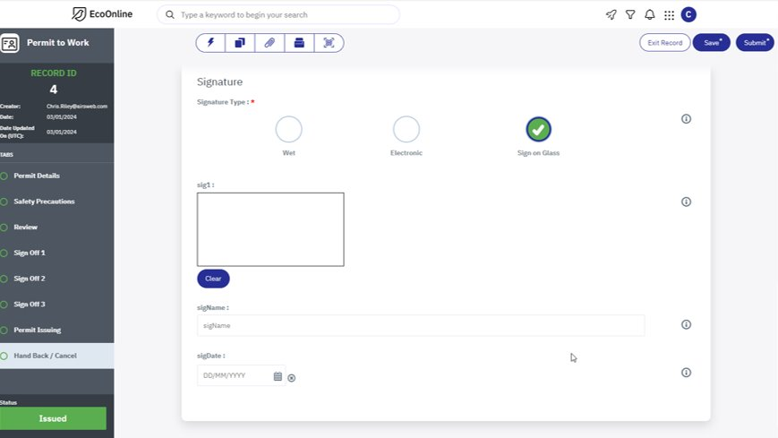
In this release, we’ve introduced a powerful enhancement to our sign off functionality, streamlining document processes and revolutionising the signing experience. Digital signatures streamline document signing processes, eliminating the need for physical paperwork, printing, scanning, and mailing. This saves time and resources, leading to increased efficiency and productivity. By reducing the reliance on paper-based processes and manual handling of documents, digital signatures help our clients save on printing, postage, storage, and administrative costs.


Key Highlights:
- Flexible Configuration Options: With the addition of the customisable digital signature field type, users have the flexibility to tailor signature requirements to their specific use cases and compliance standards.
- Efficiency Boost: Accelerate business transactions with expedited document processing and reduced turnaround times.
- Streamlined Workflows: Incorporating digital signatures into your workflows streamlines approval processes, reduces turnaround times, and eliminates the need for manual paperwork. From record approvals to internal documents and procedures, our platform empowers you to expedite approvals with ease.
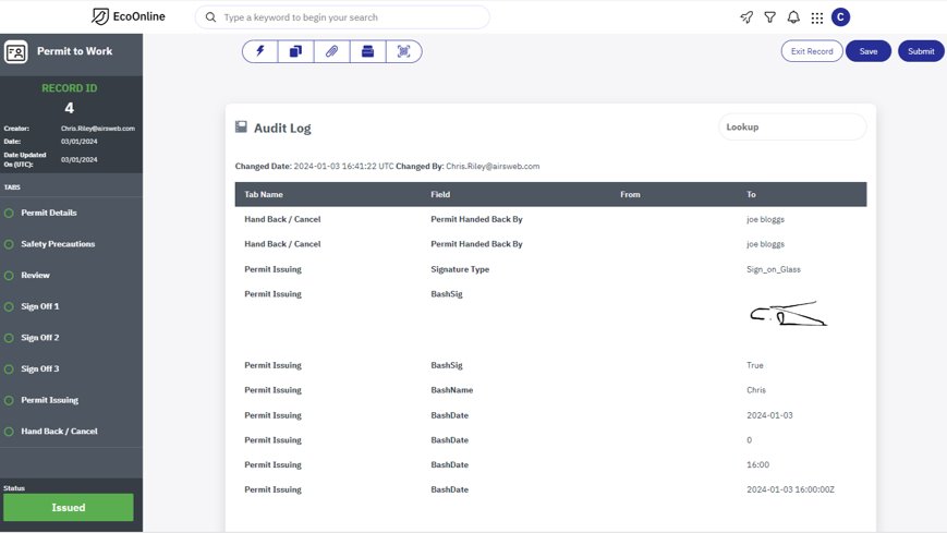
- Accountability and Transparency: Enhance accountability with a built-in audit trail that tracks the entire signing process, providing a detailed record of signatories, timestamps, and locations.
What This Means for You:
- Increased Efficiency: Say goodbye to cumbersome paperwork and manual signatures. Our customisable digital signature field type simplifies document approvals and accelerates your workflows, saving time and resources.
- Improved User Experience: Empower users with a seamless, intuitive signing experience. Whether signing documents on desktop or mobile devices, our platform prioritises user convenience.
Next Steps:
- Configure Signature Requirements: Explore the configuration options available for the customisable digital signature field type via your Customer Success Manager. Tailor signature requirements to align with your business specific needs and workflows.
- Educate Users: Provide training and resources to users to familiarise them with the digital signature feature and its benefits. Empower them to leverage digital signatures effectively in their day-to-day operations.

Accommodation of OSHA Sizing Codes Regulatory Change
We are thrilled to announce a pivotal update in our system, aligning with the latest regulatory standards set forth by the Occupational Safety and Health Administration (OSHA). In response to the regulatory change, specifically the splitting of code 2 into codes 21 and 22 for more granular establishment sizing, we have diligently adapted our platform to seamlessly incorporate these modifications.
Key Highlights:
- OSHA Compliance: Our system now fully complies with the updated OSHA sizing codes, ensuring that establishments are accurately categorised according to the latest regulatory standards.
- Enhanced Granularity: With the introduction of codes 21 and 22, we have enhanced granularity in establishment sizing, allowing for more precise classification and analysis.
- Improved Data Integrity: By accommodating the regulatory change, we uphold data integrity, enabling users to rely on our platform for accurate and up-to-date establishment size information.
- Streamlined User Experience: Despite the complexity of the regulatory change, we have prioritised a seamless user experience. Users will find the transition smooth and intuitive, with minimal disruption to their workflow.
What This Means for You:
- Accurate Reporting: You can trust that your establishment size data aligns with the latest OSHA regulations, facilitating accurate reporting and compliance management.
- Enhanced Analysis: The increased granularity allows for more nuanced analysis, empowering you to derive deeper insights into your establishment’s characteristics and safety considerations.
- Confidence in Compliance: Rest assured that your organisation remains compliant with OSHA regulations, mitigating risks and ensuring a safe work environment for all.
Next Steps:
- Update and Verify Data: We encourage users to review and update their establishment size data in accordance with the new OSHA sizing codes.
- Explore New Insights: Take advantage of the enhanced granularity to explore new insights and optimise safety measures within your organisation.
Removal of Analytics Dashboard Tile Limitation
We are excited to announce a widely requested enhancement to our analytics platform: the removal of limitations on dashboard tile quantity. In response to user feedback and evolving data needs, we have empowered our users with unprecedented flexibility and scalability in designing their analytics dashboards.
Key Highlights:
- Unrestricted Dashboard Design: Say goodbye to constraints on the number of tiles you can add to your analytics dashboard. With this update, you have the freedom to create comprehensive and visually rich dashboards tailored to your specific analytical requirements.
- Enhanced Data Visualisation: Harness the power of unlimited tiles to visualise a wider range of metrics, KPIs, and data insights. Whether you’re tracking operational performance, monitoring operational efficiency, or analysing safety behaviour, you can now display all pertinent information on a single, cohesive dashboard.
- Improved Decision-Making: By removing the tile limitation, we empower users to delve deeper into their data, uncovering hidden patterns and correlations that drive informed decision-making.
What This Means for You:
- Enhanced Visibility: Enjoy a comprehensive view of your data landscape with unrestricted access to dashboard tiles, enabling you to monitor key metrics and trends at-a-glance.
- Greater Flexibility: Tailor your analytics dashboards to your unique business objectives and analytical workflows, without compromising on the quantity or variety of insights you can display.
- Improved Collaboration: Foster collaboration and knowledge-sharing among teams by presenting a holistic view of data insights, facilitating alignment and informed decision-making across departments.
Next Steps:
- Revisit Dashboard Design: Take advantage of the newfound flexibility to revisit and optimise your analytics dashboards. Experiment with new layouts and add additional tiles to maximise the impact of your data presentations.
Update to Delete Linked Record Button
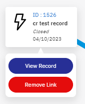
We’re excited to introduce an update to our platform that enhances the user experience and promotes safety in data management. In response to user feedback and industry best practices, we’ve relocated the delete action button to the bottom of the interface and redesigned it to be visually distinctive, now appearing in red as a warning signal.

Key Highlights:
- Improved Accessibility: The relocation of the delete action button to the bottom of the interface ensures that users can easily locate and interact with it, reducing the risk of accidental deletion.
- Enhanced Visibility: By adopting a red colour scheme for the delete button, we’ve increased its visibility and prominence within the interface, serving as a clear warning signal to users.
- Mitigation of Accidental Deletion: The redesign of the delete button helps mitigate the risk of unintentional data deletion, providing users with an extra layer of caution when performing critical actions.
- Consistency and User-Friendly Design: Our commitment to a user-centric design philosophy ensures that the relocation and redesign of the delete button maintain consistency across the platform while prioritising ease of use and clarity.
What This Means for You:
- Reduced Risk of Data Loss: With the delete action button positioned at the bottom of the interface and highlighted in red, you can confidently manage your data without the fear of inadvertently deleting important information.
- Increased User Awareness: The visual cues provided by the red delete button serve as a constant reminder to exercise caution when performing deletion actions, promoting user awareness and accountability.
- Streamlined Workflow: By streamlining the delete action process and making it more visually distinct, we aim to enhance your workflow efficiency and overall user satisfaction.
Next Steps:
- Familiarise Yourself with the Update: Take a moment to familiarise yourself with the new location and appearance of the delete linked record action button. This simple adjustment can help prevent accidental data deletions and streamline your workflow.
At EcoEHS, we remain committed to providing cutting-edge solutions that prioritise regulatory compliance, data integrity, powerful analytics tools, and user satisfaction. Thank you for your continued trust and partnership as we navigate these regulatory changes together and take another significant step forward in achieving our goal to facilitate data-driven decision-making and fuel business growth.
We are committed to empowering our users with powerful analytics tools that facilitate data-driven decision-making and fuel business growth. We believe that the removal of tile limitations represents a significant step forward in achieving this goal, and we look forward to continuing to innovate and support your analytics journey.
We value your input! If you have any suggestions, feature requests, or feedback regarding the releases mentioned above, please don’t hesitate to reach out via our Idea’s Portal.
Keep an eye out for future updates and enhancements as we strive to provide you with the best possible user experience.
